Beautiful borders from your email template editor are possible, sort of. I’ve been inspired by background images in email for a while. Some people have stayed away from them for the obvious: email client support. If done the right way, it is an invaluable layout tool. For most, it’s a well-practiced backup to the main callout. The advantage here being that you don’t use an image for the Call to action and have it completely lost if the email renderer doesn’t show images at all. With the background image separate from the text and button, you can show your CTA and text even if background images are not displayed.
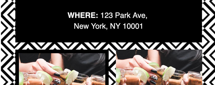
So… let’s take that a step further. The point here is that we are using a layering effect. BOOM! Why not use the space that is negative space in my email layouts to show a background or even create the appearance of a border? So you can do things like so:

Using this “effect” you can create interesting layout depth in your layout. You can have content that sits on top of a textured background, or gradient etc. This requires you to nest your layout inside another table and then use a bgcolor for the table cell, and also a background image. The tables you are using in your layout, depending on your preference, you can choose to make them transparent or set a background color.

If all of this sounds complicated you can start with any of the premade templates at https://emailutile.com/templates and choose one that suits your needs and have it assembled with the email template auto builder. You can then adjust the settings to change colors and even the data used in the construction of the html.